Nextion Editor GuideNextion Editor
Introduction
This document goes through various features of the current Nextion Editor. The Nextion Editor is used to rapidly create Human Machine Interface GUIs for Nextion HMI devices. As such the GUI can be created within Hours instead of Weeks, and Days instead of Months. So while we won’t be covering basics such as opening a file, we will point out somethings that might prove helpful to know, or reminders need be made.
Note: Nextion Editor has indeed evolved since its early beginnings, so I would like to take a moment for a quick review. As time has passed, many additional features and bug fixes were incorporated. The Nextion Editor is not expected to retain every previous behaviours between versions exactly. With the new, then there are indeed new behaviours and new possibilities.
The pandemic had created global supply shortages and to meet these challenges while keeping with Nextion quality then second source components/ICs were indeed needed. This said, while elder devices only require firmware level code to communicate with primary sources ICs, the newer devices with secondary source ICs (visually identified with QR codes on the microSD slot) indeed require more recent versions of the Nextion Editor (v1.63.3 and later recommended) for the firmware to communicate with the secondary source ICs. As such, newer devices with secondary source ICs can not make use of elder versions of the Nextion Editor (such as v0.38, or LTS) before such firmware level code was incorporated into the Nextion Editor version firmware.
Since 2020, the newer Nextion devices may give a Data Error when trying to attempt loading a *.TFT file that was created with an Editor version prior to version 1.63.3 that does not have the ability to communicate with second source ICs. One would need to compile their project with a version 1.63.3 or later and use that *.TFT file to upload their project to the newer Nextion device.
Now mostly Historical, those original Nextion devices from 2015/2016 with the Itead logo on the PCB may require an intermediary upgrade only if all the Legacy conditions are met (see the Legacy FAQ, v0.42 intermediary TFTs are supplied in FAQ), otherwise when every condition is not met then such an intermediary is not required. Devices that were upgraded to a version of the Nextion Editor v0.29 and later can not return to an earlier version (v0.28 and before). Devices that were upgraded to a version of the Nextion Editor v0.38 and later can not return to an earlier version (v0.37 and before). Enhanced Series models require v0.33 or later, when Enhanced models were introduced. Intelligent Series models require v0.58 or later, when Intelligent models were introduced. Discovery Series models require v1.62.2 and later, when Discovery models were introduced. The Nextion Editor LTS Edition (Long Term Support) can only be used with elder Basic and Enhanced devices without second sources ICs. And of course, any newer devices with the QR code on the microSD card slot requires v1.63.3 or later.
This Editor Guide will refer exclusively to the new and current Nextion Editor. Where an item within the guide may be specific to a particular Nextion series, the following icons will be used to represent the series: For the Basic T Series  , for the Discovery F Series
  , for the Enhanced K Series
  and for the Intelligent P Series
Requirements
- * Windows Operating System (XP or higher). Users must know and be able to use their Windows OS. Windows OS support is beyond the scope of Nextion, so while Microsoft discontinues there support of earlier OSes, the current Nextion Editor does run on XP with the x86 .NET 3.5 and x86 2015 VC++ Redistributable. Users are expected to know their own development environment. Note: Installations on VMware and other Operating Systems may have been accomplished successfully, but is not officially supported and beyond the scope of any manual.
- * As stated in the Note above, use of Nextion Editor v1.63.3 or later is required for newer Nextion devices with second source ICs, or a Data Error may occur when the *.tft file firmware can not communicate with the second source ICs
- * .NET 3.5 Assemblies installed. When needed, download and install the x86 .NET 3.5 Assembles from the Microsoft Website [here].
- * Ensuring the specific x86 Microsoft Visual C++ x86 Redistributables are installed and up-to-date resolved a rare issue for a couple users [here].
- * A reasonable sized monitor for the model’s resolution you are designing for is only good sense. When designing for a 320×240 or 240×320 model then a standard monitor size is probably sufficient. However, if one is designing for 1024×600 or 600×1024 resolutions, then it would stand to good reason not to expect best ease from using an 800×600 monitor resolution. For comfort, then it is senseful to use a large enough monitor resolution so that your design canvas, tool panes, menus, and event panes fit for your designing comfort. And in the reverse, a large enough screen for for your development comfort when designing for the smallest of Nextion devices. It is not appropriate to blame the Editor software for your too small monitor when you really know you need more screen real estate.
- * Basic programming skills are prerequisite. The Nextion Instruction Set is made up of ASCII text based commands inbound, and significant first byte binary Return Data. A component’s Touch Event “Send Component ID” can be used to defer programming tasks to the user’s MCU.
- * As such, quickly creating an HMI GUI for Nextion does not demand extreme skills – but basic programming skill are expected. When programming logic Nextion side, then users should have a foundation in programming.
- * Over 68,000 MCUs (any MCU with an internal UART module or two digital pins to bit-bang a Software Serial) can be used with Nextion in over 130 programing languages. MCU side programming is beyond the scope of Nextion and remains within the user’s domain and duty to know and understand their chosen MCU and chosen MCU side programming languages.
- * Uploading your completed Nextion HMI project can be accomplished either by microSD card or over TTL Serial. As there are dozens of manufactures for each of these, it is the user’s domain and duty to know their device installation, configuration and operation.
Downloading the Nextion Editor
The latest version of the Nextion Editor can be downloaded from [here]. Earlier versions of the Nextion Editor can be downloaded from the Nextion Editors and Change Logs thread in the Announcement Forum (Register for the forum, confirm and then Login to use).
There are typically two versions of the nextion-setup available for download.
- 1) The EXE version is installed through the Windows MSI for a more automated installation. Only one version of the Nextion Editor may be registered at a time via the EXE version. When updating within the Nextion Editor, Auto Update will install the EXE version
- 2) The ZIP version can be unzipped into a user chosen folder and run directly from that folder. For maintaining multiple versions of the Nextion Editor, the ZIP version is recommended. When updating within the Nextion Editor, Manual Update will launch your web browser to the download page so you may download the ZIP version
Parts to this document
- 1) Theme Styles, Panes and Other Settings … <goto>
- 2) Nextion Editor Main Interface … <goto>
- 3) Debug Simulator Overview … <goto>
- 4) Uploading your Project your Device … <goto>
- 5) External Tools … <goto>
1. Theme Styles, Panes and Other Settings
1.1 Styles
The Nextion Editor can be set to a Blue or Black themed style (Style is found in the upper right corner).
1.2 Panes
Many of the panes can be adjusted on both size and their location. To resize, drag the splitter between panes and move to resize the panes. To move a pane to a more convenient location, drag the title of the pane and release on your preferred drop point. Panes can also be pinned to retain a fixed position or unpinned to collapse to an edge when not in focus. When needed, you can reset these and any Pane settings by selecting the Reset layout under the Setting menu.
1.3 Other Editor Settings
Other settings in the Nextion Editor can be configured in Configuration under the Settings menu. The default font of the Nextion Editor can now be changed to suit your taste. The default timeout of 100ms for the Debug Simulator can be adjusted from 20ms to 5000ms. Code hints, highlighting, description, tooltips and auto-complete can be set individually for the Editor and the Debug Simulator. Default path for eeprom and sd files can be customized to suit your taste. When needed, you can reset these settings by selecting the Reset layout under the Settings menu.
In the Display Tab of the Nextion Editor on starting the Editor, there is a section for listing the most Recent Projects. The number of recent projects tracked is by default 10, and can be increased. Right-clicking a project allows you to select from the following:
- * Open the file: if the project file exists, then opens in the Editor
- * Open the folder: if the folder exists, then opens the folder in Explorer
- * Delete the current records: clears the highlighted recent projects from the list
- * Delete the invalid records: clears non existent projects from the list
- * Delete all the records: clears the recent projects list
- * The number of recent project setting: allows you to adjust the number of projects tracked
2. Nextion Editor Main Interface
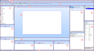
- 1) Title Bar … <goto>
- 2) Main Menu … <goto>
- 3) Toolbars … <goto>
- 4) Page Pane … <goto>
- 5) Toolbox Pane … <goto>
- 6) Attributes Pane … <goto>
- 7) Picture Resource Pane … <goto>
- 8) Font Resource Pane … <goto>
- 9) Audio Resource Pane … <goto>
- 10) Gmov Resource Pane … <goto>
- 11) Video Resource Pane … <goto>
- 12) Design Canvas (Visual Components) … <goto>
- 13) Non Visual Components … <goto>
- 14) User Event Code … <goto>
- 15) Output … <goto>
- 16) Display/Program.s … <goto>
- 17) Status Bar … <goto>
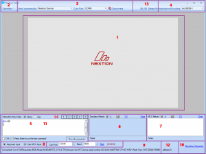
2.1 Title Bar
The Title Bar contains the path and filename of the HMI project file when an HMI project is loaded. When an HMI project is not currently loaded, you can:
- * Open an existing HMI file using the Open toolbar button.
- * Create a new HMI file using the New toolbar button.
- * Load a TFT file into the Debug Simulator by pressing Debug.
- * Upload an existing TFT file to your Nextion by pressing Upload.
2.2 Main Menu
File Menu
Here, Users can create a New project, Open an existing project, Save the current project, Save as to rename and save the currently loaded project, Close Project to close their current project, and Exit the Nextion Editor. Import Project will append an existing project into the current project – usually with resulting naming and renumbering issues. As such, it is recommended to either: a) load your project, adjust your device settings, and Save as under your new project name, or limit importing to individual pages if importing is required.
Clear Recent Projects used to clear the Project filenames in the Recent projects pane has been removed and is now accomplished in the Recent projects pane with context click and selecting Delete all records, or by managing the recent projects with more selectiveness.
Open Build Folder has been moved into TFT File Output.
With the new TFT File Output, users can select where the TFT file should be placed (which folder, sd card drive, other). A valid HMI without compile errors is required to generate a valid TFT output file. The option to open the output folder location in Windows Explorer can be made by clicking only open the output folder link. The old folder location C:\Users\Username\AppData\Roaming\Nextion Editor\bianyi will still contain previously compiled TFTs from elder Editor versions, and only if this is used as the TFT File Output location, will the new TFT for the current project be added to that folder.
The Backup Directory has been renamed to Version backup folder only keeps a copy of an older HMI project opened with a new version of the Nextion Editor launches Windows Explorer to the C:\Users\Username\AppData\Roaming\Nextion Editor\backup folder.
The Virtual EEPROM Folder located C:\Users\Username\AppData\Roaming\Nextion Editor\eeprom contains the eeprom.bin for the Enhanced/Intelligent series models. The default folder can be customized in Settings > Configuration.
The Virtual SD Card Folder located C:\Users\Username\AppData\Roaming\Nextion Editor\sdcard0 allows users of the Intelligent series models to copy project files here that will eventually be on their Nextion microSD card, allowing users to test their project in the Debug Simulator. The default folder can be customized in Settings > Configuration.
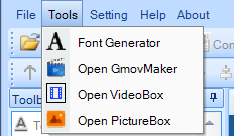
Tools Menu
Under the Tools menu, users can access the external tools Font Generator, GmovMaker, VideoBox and PictureBox. These are covered individually in Section 5 of this Guide.
Setting Menu
The Setting menu contains two items: Configuration and Reset layout.
In the Configuration menuitem, the user can choose for the Nextion Editor and the Debug Simulator if code should be highlighted or not, if Auto-Complete should be on, if the descriptions for instruction parameters should be on or not, if the tooltips should be shown when the mouse is over the toolbar buttons.
For serial data in the Debug Simulator, the timeout can be adjusted from its 100ms default value to a user selected value within the range from 20ms to 5 seconds.
For the new Intelligent Series, the user can choose if there should be a 3 second delay at screen edge before allowing the component position to escape to the outside of the canvas area. This is useful to be on, especially in the Basic, Discovery and Enhanced models as out of bounds positioning is not permitted and will cause the project to not compile.
For the eeprom/sd folder, the user can choose to use the default path, or can set their own custom path that is more suited to their system and workflow.
Transparent color replacement value defaults to the 565 color 0 (BLACK), and is useful when importing images into the Picture Pane to convert the transparent pixels to a desired color when transparency is not supported (ie: Basic, Enhanced and Discovery Series models).
Image format for the Intelligent Series defaults to the YUV422 standard, but can be set to the YUV420 standard when desired.
Finally, the default Font used for the Nextion Editor can be changed to suit the users taste. Currently, this default font effects both Editor wide as well as the Event code font. Resetting the font to the default Microsoft Sans Serif will return the Editor to its normal traditionally used font.
Reset layout will reset the Nextion Editor default panes back to their original positions. This is a useful starting point if you have somehow misplaced your pane or positioned it in some obscure unreachable position.
Help Menu
The Nextion Instruction Set is no longer available as a Tab in the Nextion Editor.
Selecting Instruction Set menuitem will launch the Nextion Instruction Set in your default web browser.
Selecting Editor Guide menuitem will launch the Editor Guide in your default web browser.
About Menu
Selecting About Nextion Editor menuitem in the About menu will show the about box with the version of the Nextion Editor. Clicking the link will take you to the Nextion website where you can access the forums and other documentation.
Selecting Check for new version menuitem in the About Menu will show the Update dialog when a new version is available (see Downloading the Nextion Editor at the beginning of this Guide), or a dialog informing that you have the most recent version.
2.3 Toolbars
Open, New and Save
These will Open an existing project, create a New project, or Save the currently opened project.
Compile
Use Compile to check for errors in the currently loaded project. Any Warnings or Error Messages will be placed in Output Pane.
Pay attention to any warnings as these will mean your project may not run as you expect. Pay attention to any error messages as they will need to be corrected before continuing. Error messages are descriptive, and if it is a code error then the user can click to jump directly to the coding error location.
Compile is more of a building and assembly process. This is only stated so that users do not make the wrong expectations of native machine code when making feature requests and/or Bug Reports. Nextion remains closed source.
A TFT file is no longer built and placed in the bianyi folder on Compile. To generate a TFT file, one has to use the TFT file output menuitem located under the File menu
Debug
The Nextion Editor contains a built-in Simulator that can be accessed via the toolbar Debug. To be clear this is not a precision emulator and is intended to be sufficient to assist in debugging a users project. It in no way is meant to replicate the Nextion device exactly. (Any Windows OS is already sufficient to make such precision unattainable). The Debug Simulator will be covered in more detail in Section 3 of this Guide.
If a project is not currently loaded in the Nextion Editor, Debug will open a dialog to open a compiled *.TFT file directly. This is handy for loading demos or sharing ideas without surrendering your original source code. Although the Debug Simulator can run a *.TFT file from any Nextion Series or model supported by the version of the Nextion Editor, it is important that the same version of Nextion Editor and *.TFT file is used to successfully simulate. (ie: an older v0.36 project TFT file can not be used with the current version of the Nextion Editor.)
Upload
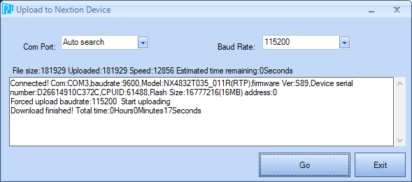
Selecting Upload will launch an Open dialog to select a *.TFT file before the Upload to Nextion Device dialog. Ensure the Nextion is connected via serial (typically via USB to TTL adapter) before upload or the Port may not be available to select. Auto search feature will look for your Nextion’s reply to the connect instruction, but realize that data is being sent on all serial ports that are searched (and may interfere with the other connected serial devices). A better choice is to select the correct Port and Baud Rate. Proper configuration of Serial adapters, Windows drivers, device conflicts, etc is beyond the scope of Nextion support and remains the domain of user responsibility to know their used Operating System and devices.
Once Nextion has responded to the connect instruction, the upload process will begin. Do not interrupt this process until completed. If the process has been interrupted, resetting the serial port may be required. When a partial *.TFT file has been uploaded and uploading over serial is no longer an option, then the user will need to upload via the microSD method. Refer to Section 4 of this guide.
Copy, Cut, Paste and Delete
Users can select components or multiple components and then Copy, Cut, Paste or Delete as required. Paste contains a drop down option to in place paste which will copy without any vertical or horizontal offsets.
Lock and Unlock
Users can select components or multiple components and then Lock or Unlock as required. Locking prevents a component from being repositioned with the mouse until unlocked. A lock icon appears in the upper right corner of the visual components when locked that can interfere with visual inspection of your HMI design.
Undo and Redo
Use Undo and Redo to Undo the last operation, or to Redo the last operation undone.
The Component Layout Toolbar
For Renumbering components: Bring Top (Arrow Up) will take the selected component(s) and renumber to the highest .id on the page. Bring Bottom (Arrow Down) will take the selected component(s) and renumber to the lowest .id starting at 1 (page component is always 0) on the page.
For Aligning components: Align Left, Align Right, Align Top and Align Bottom will take a group of selected components (green ID labels) and bring the alignment to match the component with the blue ID label.
For Resizing components: Same Width, Same Height and Same Size will take a group of selected components (green ID labels) and set the size (width, height or both) to match the component with the blue ID label.
For Spacing components: Make horizontal spacing equal, Increase horizontal spacing, and Decrease horizontal spacing will take a group of selected components (green ID labels) and adjust the horizontal spacing between components using the component with the blue ID label as the baseline component. Likewise: Make vertical spacing equal, Increase vertical spacing, and Decrease vertical spacing will take a group of selected components (green ID labels) and adjust the vertical spacing between components using the component with the blue ID label as the baseline component.
Device
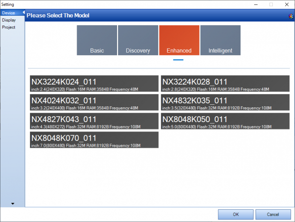
The steps to configure your HMI project for your Nextion Series and Model are usually done at the time of creating a New project. When you need to make changes, Device will launch the following window with the Device tab selected. First select the Nextion Series: T for the Basic models, K for the Enhanced models, and P for the Intelligent models. Then select your Nextion Model. For example: the Multi-touch Capacitive Nextion NX8048K070_011C, Select K for the Enhanced series and then the select the NX8048K070_011 Nextion Model.
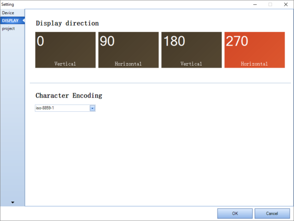
Selecting the DISPLAY tab, the user can select the orientation and the Character Encoding. 0° is the native viewing angle for the selected model. Users can choose alternative orientations (90°, 180° or 270°) but this will not be the native viewing angle.
Character Encoding is default iso-8859-1. Select from the character encodings that make sense for your HMI project to best display your local character sets. There are a selection of single byte and double byte character sets available.
Currently supported Character encodings include:
ASCII, ISO-8859-X (1,2,3,4,5,6,7,8,9,11,13,15), UTF8,
GB2312, BIG5, KS_C_5601-1987, Shift-JIS, koi8-r,
Windows 874, 1255, 1256, 1257, and 1258
Note: An encoding is a character mapping of value to character. Computer systems and MCUs use numeric values and not characters. A byte numeric value 0x41 in single byte ASCII encoding will reference the character A. Your MCU will not send A, it sends byte 0x41 (which in many cases maybe mapped to the letter A), but does not explicitly mean 0x41 renders A in every encoding. A Byte value of 0xC4 can map to different characters in different encodings, or even be undefined (mapping to no character). While modern computers can do translations between many encodings, your MCU will likely not. It is useful to research the character encodings you are planning to use.
Note: While the Nextion Editor HMI project can only have one base character encoding. This does not prevent the inclusion of different encoded fonts within your HMI project. Building on the above explanation, when your MCU sends a byte 0xFF to the Nextion device, the component .font attribute is responsible for which Font resource the byte 0xFF is rendered in (provided the chosen font resource has a glyph to render and is not undefined).
If you desire to password protect your entire HMI project, selecting the project tab will bring up the Open Password Setting button. If an existing password exists, it will need be entered before a new password can be set. When a Password is lost, it is not retrievable. Fair warning is given: DO NOT LOSE YOUR PASSWORD. There is no recovery! A project with a lost password would need to be rebuilt! So, do not lose – or – do not use.
One-time update option will rename the *.tft file on your microSD card to a different extension after successful upload. You can now also now choose to ignore your pictures (image resources) and fonts (library resources) at compile time. While this is a small time saving step, it is recommended to turn these off when you are ready to create your final project compiled TFT.
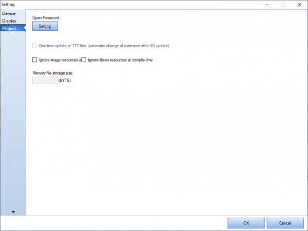
For the Intelligent series, Memory file storage size for external picture resources is specified in Bytes.
ID
Selecting ID to will toggle if the component .objnames are displayed in the upper left region of the component space. Yellow labelled components have a .vscope local, while black labelled components have a .vscope of global. (Hint: Event code is never global). When selecting multiple components, green labelled components indicate multiple components have been selected, while the one blue labelled component will be used as the baseline component. To change the baseline component while the group is still active selected, simply click on the already selected component you want to become the baseline component.
Canvas Zoom
New to the Nextion Editor is the ability to Zoom the design canvas both in and out. Users can zoom from 20% to 600% using the slider, or increment steps using the + and – buttons on the ends of the slider. The value of the zoom is shown in percentage to the right of the Canvas Zoom. Clicking on the percentage zoomed allows you to reset the zoom back to an unzoomed 100% state. Note: Component dragging-by-edge (indicated by double ended arrow pointer) to move or resize components whether intended or accidental can cause an undesired snap-to effect in size and/or position where zoom is not at 100%. Calculation for the placement of component or edge must be to whole numbers and as such drag ending on partial-pixels can indeed effect component size, position or both. In the event of undesired results, use the Undo (ctrl+z) to revert back to your previous unaltered state. Version v1.65.0 maintains edge-dragging to resize, a drag movement will not resize the component.
Project Startup Code
Selecting the C on the toolbar will open the Program.s tab in the Design Canvas area. To return to the Design Canvas, click the Display Tab. The Project Start Up code section is a newly introduced concept allowing for users to define and initialize additional int globals (such as sys0=0). At the moment only int 32 bit signed integers are supported. Additionally project start up code can be added in this section to be run before the HMI runs using Nextion Instructions.
Note: Nextion Preamble 0x00 0x00 0x00 0xFF 0xFF 0xFF NIS 7.19 and Nextion Ready 0x88 0xFF 0xFF 0xFF NIS 7.29 have been moved from firmware start notifications into Program.s as a printh instruction. Users can now choose to keep these notifications or discard by removing this printh line. Default values for dim, baud and recmod also prepopulate in Program.s as this is the recommended location for setting these variables (historically was recommended in Page Preinitialize Event before Program.s existed). Also important to note that once a page instruction or system variable dp assignment has been given the HMI will change to the desired page and will not return to Program.s to run instructions beyond the page change instruction.
Remark Line On / Remark Line Off
When in the Project Startup Code, using the Comment or Uncomment on the tool bar will comment the selected line(s) or uncomment the selected line(s) in the same manner as the Event Pane does with user code.
2.4 Page Pane
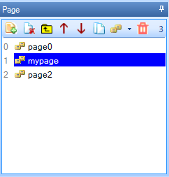
Every HMI project needs to have at least one Page. Pages can be created and imported into your HMI project through the Page Pane. A Page is created with Add, deleted with Delete, and copied with Copy. Insert will create a new page before the highlighted page. Use the Move Up and Move Down to renumber the page number within the Page Pane. Using Delete all (Trash) will delete all pages within the project.
Pages can be renamed to a maximum of 14 characters and the page names are case sensitive (avoid using space and other characters that can be code ambiguous as this could cause code parsing issues: Since the Intelligent Series, the Editor compile becomes more strict). To rename your page highlight the page, right click. and select Rename. Then enter your new name (it is recommended to press Enter to ensure the change takes place). Double clicking a Highlighted page name will also trigger the page renaming function.
The page Lock and Unlock functions are only accessed by right clicking the highlighted page name and selecting Lock or Unlock. If the page has been locked with a password, the password must be entered to access the components and event code. There is no password recovery should the password becomes lost, so don’t use or don’t use. As an example, the keyboard pages are imported as locked, but do not use passwords (the keyboard pages are also a good coding example to review). When keyboard pages are imported by the Nextion Editor component .key attribute, reset system page option is included in the context menu, which is used to reload the keyboard page and proper orientation in the cases where the keyboard page may have been edited or display orientation options may have changed.
Pages can be exported from one project to another project with Export page. This is the preferred way to share components and partial projects. Page files *.page can not be compiled on their own. If you want to export a page as locked or locked with a password, this must done before exporting.
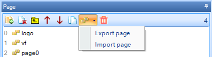
To import a page, use Import page. Imported pages can be used independent if they are locked with a password, locked without a password, or unlocked. Locking is to protect the code. So as long as proper documentation about the page variables and functions accompanies the *.page file, an end user can use even a locked page. When a page is imported with naming conflicts, the affected conflicting names will be renamed. It is therefore relevant to perhaps select meaningful names. To import a copy of one of the keyboard pages, one can either import the *.page file directly or use the .key attribute of a Text, Scrolling Text, xFloat or Number component.
In an HMI project a page is a localized unit. When changing pages, the existing page is removed from memory and the requested page is then loaded into memory. As such components with a variable scope of local are only accessible while the page they are in is currently loaded. Components within a page that have a variable scope of global are accessible by prefixing the page name to the global component .objname.
As an Example: A global Number component n0 on page1 is accessed by page1.n0. A local Number component n0 on page1 can be accessed by page1.n0 or n0, but there is little sense to try access a local component if the page is not loaded. Only the component attributes of a global component are kept in memory. Event code is never global in nature.
A Page always contains a page component, and this page component will always have an .id of 0. Making the page component global, does not make the components within a Page global – just the few page attributes of the page component. The page component .id used with the b[.id] component array is not the page index number used with the p[index] page array.
A Page component can have a background of either : Solid color, image background, or no background. An image background should use a fill screen image to avoid calling non-existent data. No background will show the current page components over top the last unloaded page, this must be used with caution. No background on a no background, on a no background soon causes unwanted side effects. There is a hard limit of 250 components allowed per page, and theoretically up to 254 pages per project (likely resources will be depleted before any page254 is reached).
Built-in-Keyboard Pages
Nextion Editor now has four different built-in-keyboards that can be added to a project. This allows for Text, Scrolling Text, Xfloat and Number component .txt and .val to be changed using a built in keyboard by the device user at runtime. In order to add a built-in-keyboard to your project, the component must first be set to .vscope global, second the .key attribute needs to select your desired keyboard. Selecting one of the keyboards will add the keyboard page to your project. Choices are full qwerty style (keybdA), numeric keyboard (keybdB), speed dial style (keybdC), and Chinese Input (Pinyin) style (keybdAP). The associated keyboard will load an appropriate font if not already included in the project and the keyboard page for the model size and orientation. Should you choose to change model size or orientation, use the context-menu (right click) for the keyboard page and select Reset System Page to reload.
Keyboard pages are first loaded locked. You can unlock the keyboard page by using the context-menu (right click) the keyboard page and select unlock. Do so with care. You can then review the code within the keyboard page and choose to modify it when you have reviewed and have understanding what they keyboard page is doing. Caution: Selecting to Reset System Page will abandon all your modification changes made to your customized keyboard.
For the Chinese Input (Pinyin) keyboard, the HMI project should be encoded using gb2312, this is currently the only supported encoding.
2.5 Toolbox Pane
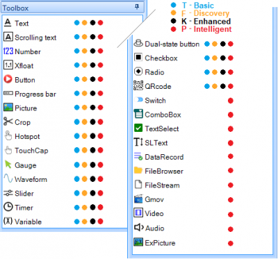
The Page component not listed above is always created when the new Page is added to the Page pane. The page component will always have an .id of 0 and is always the bottommost layer. New page effects and swipe-to-change-page capabilities are added for the Intelligent series. There is a hard limit of 250 components allowed per page.
Many components have multiple .sta choices of
– crop image (pulls background from .x and .y location of a user chosen picture resource)
– solid color (sets background to be a user chosen 565 color)
– image (text if any will be drawn over the user chosen image)
– transparency (pulls background from underlying layers for transparent pixels)
Many components have multiple .style choices of
– flat (no lines will be added around edges)
– border (lines will be drawn around edges)
– 3D_Down (lines will be drawn to yield impression of lowered)
– 3D_Up (lines will be drawn to yield impression of raised)
– 3D_Auto (lines will be drawn Up/Down according to state)
Many components have multiple text alignment and placement options
– .xcen of Left, Center or Right
– .ycen of Top, Center or Bottom
– .spax will add extra blank pixel spacing to right of each character
– .spay will add extra blank pixel spacing to bottom of each character
– .isbr for multi-lined (set to true) or single line (set to false)
– .pw for masking (Character is off, Password will mask with an asterisk)
For the Intelligent Series, most components have new capabilities
- repositionable by assigning .x and .y values, or by move instruction
- user draggable at runtime by setting .drag
- alpha channel blending (fading effect) by setting .aph attribute
- additional attributes not available for the Basic, Discovery or Enhanced component
- and other effects found in the .effect attribute
- NOTE: with many more customizable attributes for the Intelligent Series components, it is wise to click the attribute in the Attribute Pane (see Section 2.6) for a full attribute description. ie: Intelligent Series Gauge .vvs2 attribute now controls the foot length of the gauge needle (attribute not available for the Basic, Discovery or Enhanced Series).
The Text component is a highly customizable component. The Text component has the .pw attribute for masking (Character is off, Password will mask with asterisk) and the .key attribute for integrating one of the included example keyboards (must be set to .vscope global before use).
The Scrolling text component combines an integrated timer component with a text component. The .pw option is not available with this component. The .key attribute allows for integrating one of the included example keyboards (must be set to .vscope global before use). There is a hard limit of 12 timer components per page within your project.
The Number component is used for signed 32-bit integer values. The .lenth (as spelled) sets the number of digits shown (useful for leading zeros). The .format attribute allows for a choice of integer, currency (comma separated every three digits, not float values), or hexadecimal. Input should be in integer or hexadecimal. The .key attribute allows for integrating one of the included example keyboards (must be set to .vscope global before use).
The Xfloat component is used for signed 32-bit integer values. The .vvs0 sets the number of digits shown to the left of the decimal (useful for leading zeros). The .vvs1 sets the number of digits shown to the right of the decimal. The .key attribute allows for integrating one of the included example keyboards (must be set to .vscope global before use).
The Button component is again highly customizable and integrates text in a momentary manner. Use text, images and event code to suit tastes.
The Progress bar component is for progress, thus a valid range of 0 to 100 to represent the percentage of progress. (Please no more requests to extend the range, even if many may give 110% effort). Best effects for progress are attained using images.
The Picture component will allow any picture resource to display in the Picture component. Example p0.pic=3. It is important that the picture resource matches the user defined size in .w and .h or the picture resource will over draw the picture component boundaries, or incorrectly insert adjoining data. The Picture component is useful to represent multi-states and animation sequences. Note: when you want a background picture to a Page, do not create a full screen sized Picture component over top the .sta solid color page: This will likely result in flickering on redrawing. Rather, set the page to .sta image and set the now exposed .pic attribute to the desired Picture Resource image. In this manner you achieve a page background image without the background being the cause of flicker.
The Crop component will replace its boundaries with the same location and boundaries from the picture resource pointed to with .picc. It is highly recommended that the picture resource being used is a full screen image to avoid errors (must be fullscreen image). The Crop component is useful to represent states.
The Hotspot component is a user defined touch spot to its overlaying region. At a 2 pixel by 2 pixel region, it makes for a useful code holder to be later called by the click instruction – thereby creating a user defined function. As a Hotspot, it turns any image area beneath into a button, such as in creating a customized keyboard.
The TouchCap component is a non-visual component that stores in its .val attribute the .id value of the last component touched (pressed or released). Even though the TouchCap is a non-visual component it has both Touch Pressed and Touch Released events that are triggered on the internal setting of the .val value, this is useful to trigger code in the TouchCap events on a touch event (pressed or released) as would be the case in any other visual component. Only one TouchCap component will be useful on a page – if there are two or more TouchCap components on a page, the TouchCap component with the highest .id value will supercede any TouchCap component with a lower .id value. Note: A TouchCap Send Component ID checkbox will always reset to the unchecked state as it is never this component that triggered the physical touch. Rather, use the individual component’s Send Component ID checkboxes or mimic a touch event using print statements. Touch Event format is listed in NIS 7.21
(ie: printh 65 prints dp,1 prints tc0.val,1 printh 00 or print 01 and printh FF FF FF).
It is also note worthy to mention as a reminder: Nextion Resistive devices have only process a single touch – meaning first component pressed will be registered and no other component can register until the first component pressed is released. Nextion Capacitive devices are multi-touch devices registering up to 5 different touch components and they are registered in the order of pressed and released as they happen in sequence they occur up until when the 6th component is pressed and the sixth component will not register. This complexity is simply the nature of multi-touch and requires a higher degree of workflow planning for precision execution – Nextion still remains consecutive processing of events and a “next-event” will not be processed until the current event has completed.
The Gauge component is a full circular component with value in degrees. This means a range of 0 to 360. In Basic, Discovery and Enhanced series: Gauge components are not useful for stacking (example: a three handed clock), as the redrawn gauge will overwrite any lower gauge. The gauge component is always a square in nature. Semi-circular gauges at the screen’s edge are not achieved with the gauge component. In the Intelligent series: a stackable gauge with highly customizable needles and out of bounds positioning can achieve many effects not possible in the other series.
The Waveform component is used to plot y axis data points on up to 4 channels. Waveforms are never global: in that adding datapoints with add/addt can only be done when waveform is on the active current page. Waveform .vscope of global allows plotted data to be maintained between page changes. Waveform .vscope of local, the data points are not retained, changing pages away and back will revert the waveform to an emptied state. Up to 4 waveforms can be used on a single page. The Waveform component is limited to a y axis data range of 0 to 255 or 0 to waveform height -1. As a data point is added, it will consume one column, with the next data point using the next column. Recent changes now allow a variable to be used in the add command. Example add 1,0,h0.val. The addt command becomes useful to refill the waveforms on page load (such coding remains within the user domain).
The Slider component can be horizontal or vertical. The slider has the added event code for Touch Move, useful for providing updates to the sliders current position. Best results are attained with images. Slider length includes the size of the thumb as well as the range (often overlooked in calculations). Snapping a slider to its value position can be achieved with h0.val=h0.val where slider .objname is h0.
The Timer component is not expected to be a high precision interrupt driven component. It is however useful for queueing reoccurring event code after elapsed .tim has expired. As code is sequentially processed, it is very easy for the time to process the requested user event code to exceed the .tim intervals and therefore not interrupt driven (to avoid such stack overflows) and not high precision. There is a hard limit on the maximum number of timers running in a single page, this limit is 12. Beware that the scrolling text component integrates 1 timer. Timer attributes can have a variable scope of global, event code is never global. As such timer code can only be triggered within the current page they are designed in. As the timer is a non visual component, they are added below the Design Canvas.
The Variable component is a non visual component and also added below the Design Canvas. Variables are either 32 bit signed numeric or string content can be selected with the .sta attribute at design time.
The Dual-state button component is an expanded Button maintaining its toggling state between press/releases.
The Checkbox component is another example of a lightweight dual-state component with less customization and lower memory usage.
The Radio component is yet another example of a lightweight dual-state component with little customization and lower memory usage. Obtaining grouping is achieved via user code (remains in the user domain).
The QRcode component is used to generate a 2D scanable QR. It is limited to a byte maximum for the .txt_maxl attribute of 84 (of up to a max 154 bytes) on Basic T models and 192 bytes on the Enhanced K and Intelligent P models. The QR component will consume some user HMI SRAM when included in an HMI project to facilitate the QR rendering.
New components for the Intelligent series
The Switch component is an expanded dual-state combining text and graphics.
The ComboBox component is used to present an expandable/collapsible selectable list with the .path attribute holding options one per line. The number of selected item held in .val and .txt holding the text of the selected item.
The TextSelect component is used to present a cyclic spinner with .path attribute holding options one per line. The selected item number in .val and .txt holding the read-only text of the selected item.
The SLText component is used to present a scrollable textbox with .txt holding multiline data. The position of the list in pixels can be set through the .val_y attribute.
The DataRecord component is used to present a dataset in a scrollable table. DataRecord supports up to 12 fields per record. DataRecord incorporates 4 methods .insert(), .delete(), .up() and .clear(). Configuring DataRecord attributes for your application requirements will need be thoughtful at your HMI design time.
The FileBrowser component is used to present a folder and file structure tiled in a filter capable browser. The .dir attribute holds the folder path, and the .txt attribute holds the selected filename. FileBrowser incorporates an .up() method to return to previous folder. Be sure to ensure an appropriate font has been included to your project for filenames to be displayed.
The FileStream component is a non visual component for working with a file, it incorporates 5 methods .open(), .close(), .read(), .write() and .find(). A file is of finite size when user creates the file, appending beyond the file end is not supported.
The Gmov component is used to present an animation, with up to 16 Gmov components on an HMI page. Use the GMovMaker Tool to create an animation in the Nextion *.gmov format using supported *.jpg, *.bmp, *.png and *.gif source files. The Gmov component contains an additional Play completed Event to trigger user code at the end of each iteration of the animation.
The Video component is used to present a movie, with up to 6 Video components on an HMI page. Use the VideoBox Tool to convert a movie into the Nextion *.video format. The Video component contains an additional Play completed Event to trigger user code at the end of each iteration of the Video. Use the .from attribute as external file and .path attribute to use *.video files stored in ram or on Nextion’s microSD card.
The Audio component is used to present wav files that are stored in ram or microSD card. Use the VideoBox Tool Audio tab to create audio resources in the Nextion *.wav format. The Audio component contains an additional Play completed Event to trigger user code at the end of each iteration of the Audio. Use the .from attribute as external file and .path attribute to use *.wav files stored in ram or on Nextion’s microSD card. Note: Nextion Audio capabilities is 2 Channel with 10 band equalizer with output to a mono speaker. See Instruction Set play instruction, and system variables volume, audio0/audio1, eql/eqm/eqh, and eq0..eq9 in NIS Section 6.
The ExPicture component is used to present pictures that are stored either in ram or on microSD card. Use the PictureBox Tool to create picture resources in the Nextion *.xi format that can be stored in ram or on Nextion’s microSD card. ExPicture can display images that are in the same selected orientation as the HMI and either Nextion’s *.xi format or JPEG Baseline DCT only.
To add any of the above components to the currently design page, simply click on the component and it will be added with its .id set to the number of components on the page. All components within a page are listed in .id ascending order in the Component Drop down in the Attributes Pane. Then continue with placement and adjustment of .attributes as desired.
2.6 Attribute Pane
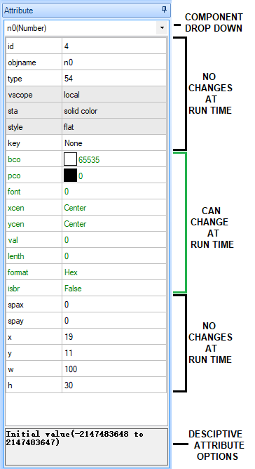
The Attribute Pane contains the list of components included within the current design page in the Component drop down. Clicking on a component, or selecting it from the drop down will display the component’s available attributes. The left side contains the attribute name, the right side contains the attributes current value. Clicking on an attribute will display the attributes meaning and valid range/options at the bottom of the Attribute Pane. Double clicking a field with bring up resource editor for the attribute if attribute has such (ie: .pco opens color picker, .pic opens picture chooser).
Any attribute in black is read only at runtime (with the exception of .objname which remains inaccessible). Any attribute in green can be both read and changed by user code at runtime. Empty unassigned attributes values or invalid attribute values will need to be resolved before a successful compile can be achieved. When renaming a Components .objname: avoid using space and other characters that can be code ambiguous as this could cause code parsing issues.
Page name prefixing is suggested to access a global component’s attributes on another page.
– example: page0.va0.val
Page name prefixing is not required to access a local component’s attribute on the current page
– example: va0.val
Attributes that have ranges are evaluated in full during Nextion’s parsing of a complex expression and as such care is required. Nextion is stated as simplex expression, although these rules are often bent. Use care.
– example: gauge z0 with a .val range of 0 to 360.
z0.val=va0.val+step.val%360
Should va0.val+step.val exceed 360 the assignment fails before arriving at modulo 360.
– this is the nature of simplex expressions (think assembly language), and bending the rules has side effects.
The various combinations of attribute choices provides a wide range of expected behaviours with too many combinations to cover in any manual(s). This combined with the Nextion Instruction Set creates the opportunity for very powerful HMIs.
There is an HMI hard limit for a combined tally of attributes and user code of 65534.
2.7 Picture Resource Pane
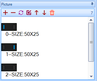
Pictures are imported into your HMI project through the Picture Resource Pane. A picture is added with Add, deleted with Delete, and swapped with Replace. Insert will add the imported pictures before the highlighted picture. Use the Arrow Up and Arrow Down to renumber the picture resource number within the Picture Resource Pane. Using Trash will delete all pictures within the pane. Note that Delete will not delete a picture resource if it is being used with a component.
The accepted picture types to import are *.jpg, *.png, non animated *.gif and *.bmp files. When importing a picture, the picture is converted into the 565 16 bit color format used by Nextion. In Basic and Enhanced models: Nextion is not a graphics card, as such transparency and in picture animation is not supported. In native 16-bit color, picture resources consume 16 bits per pixel, or width x height x 2 bytes. In Discovery models: some image compression is achieved breaking the traditional 2 byte per pixel formula and allowing more pictures in the same amount of flash compared to Basic and Enhanced models. In Intelligent models: Nextion now supports transparency and configurable image compression allowing more picture resources for the same space, the 2 bytes per pixel formula does not apply.
Exporting a picture resource is accessed by highlighting a the picture resource, right clicking and selecting Export. The available picture formats for export are *.jpg, *.png and *.bmp as per the resource being exported. Note that *.jpg may save space but is a lossy format: once the data is lost, it is lost. Note that exporting pictures is with the naming convention picture resource #.format. Exporting will no longer overwrite a pre-existing file as it once did, but will now append a _# format to the filename portion where the higher appended number is the latest exported.
When using cropping, a full screen image is strongly recommended for the background. This avoids pulling data from non-existent space – which will resemble randomized colors (data from other locations). Cropping can consume more cycles than using a picture, using a picture will consume more cycles than solid colors. When cycle time becomes to high to render, tearing and flickering will be the sign. Nextion is an HMI device and not designed for HD multi-media and streaming. That said, amazing effects can still be achieved with purposeful programming.
A picture resource has the following limitations:
1) longest edge can not exceed 4080 pixels
2) width x height can not exceed 614400 pixels
Assignment of the picture by code at runtime would look like:
p0.pic=1ÿÿÿ over serial, or as p0.pic=1 inside an event as code.
2.8 Font Resource Pane
The ZI Font Resource is very important! If any visual component used in the user’s project contains a .txt or .val attribute, then at least one font must exist in the project. If a user wants to use various size of styled fonts in their HMI project, they will need to generate a ZI Font file for each style and size they will use. For most users this will mean starting with a ZI Font generated with the built-in Font Creator (covered in the Menu section above).
These *.zi font files will need to be added into the ZI Font Resource Pane. Each ZI Font Resource will show the font resource number, it’s given name user gave at creation time, it’s size in pixels Width X Height, it’s character encoding, number of characters in the set and the size in bytes the font contributes to the HMI project’s overall filesize. The appropriate *.zi font can then be selected by its number and assigned in a visual components .font attribute. Note that the design size of the visual component is set at design time and can not be changed at runtime.
Assignment of the font by code at runtime would look like:
t0.font=1ÿÿÿ over serial, or as t0.font=1 inside an event as code.
Properly formed monospaced ZI font resources from v0.53 (and prior) will have a width that is either equal to the height or a width that is half the height. Height will always be a multiple of 8 from 16 to 192. ZI fonts are monobit (pixel is either on or off) and Fixed Width. Hint: Generating a proportional font like Arial where W and @ are 24×24 and squeezing into a 12×24 space is like pouring 2 litres into a one litre bottle and expecting all 2 litres have been saved. Fonts that do not conform to the ZI size formula just stated can indeed have issues when it is rendered on the Nextion device.
With the introduction of the Intelligent Series, an anti-aliased non-fixed width font can now be generated. Be mindful that the max visual space required for characters of an anti-aliased proportional font is not width x qty as it was with the elder ZI fixed width font. Proportional fonts such as Arial contain characters of varying width (W is indeed wider than l).
A ZI font resource can be viewed by selecting the font and double clicking the selected font. Subset ZI fonts can be redefined and regenerated with Change Font button at the bottom of the Font Preview window. Trash will Delete all loaded ZI Font Resources. Multiple *.zi fonts can be imported with Add. A font must not be associated to a component to remove with Delete. A font can be swapped out with a different font using Replace. Insert will import the font before the highlighted font. Use the Arrow Up and Arrow Down to renumber the font resource number within the ZI Font Resource Pane.
Exporting a font resource is accessed by highlighting a the font resource, right clicking and selecting Export. Note that exporting multiple fonts is with the naming convention font resource #.zi. Exporting will overwrite a pre-existing file.
2.9 Audio Resource Pane
Audio resources are imported into your HMI project through the Audio Resource Pane. An audio resource is added with Add, deleted with Delete, and swapped with Replace. Insert will add the imported audio resource before the currently highlighted audio resource. Use the Arrow Up and Arrow Down to renumber the audio resource number within the Audio Resource Pane. Double clicking on a selected Audio resource will preview/play the audio file in the Nextion Editor. Using Trash will delete all audio resources within the pane. Note that Delete will not delete a picture resource if it is being used with a component.
Use the VideoBox tool in the Tool menu to assist with converting your audio resource to ensure a usable resource.
2.10 Gmov Resource Pane
Gmov resources are imported into your HMI project through the Gmov Resource Pane. A Gmov animation is added with Add, deleted with Delete, and swapped with Replace. Insert will add the imported Gmov resource before the currently highlighted Gmov. Use the Arrow Up and Arrow Down to renumber the Gmov resource number within the Gmov Resource Pane. Using Trash will delete all Gmov resources within the project. Note that Delete will not delete a Gmov resource if it is being used with a component. Double clicking on a selected Gmov resource will preview/play the Gmov resource.
Use the GmovMaker tool in the Tool menu to assist with creating your Gmov resource and ensure a usable resource.
2.11 Video Resource Pane
Videos are imported into your HMI project through the Video Resource Pane. A picture is added with Add, deleted with Delete, and swapped with Replace. Insert will add the imported pictures before the highlighted picture. Use the Arrow Up and Arrow Down to renumber the picture resource number within the Picture Resource Pane. Using Trash will delete all videos within the pane. Note that Delete will not delete a picture resource if it is being used with a component.
Use the VideoBox tool in the Tool menu to assist with converting your video resource.
2.12 Design Canvas
This is the main design space for the visual/touch components for the current Page. The Page’s page component is always .id 0 and always the most back layer. The mouse coordinates are displayed on the Status Bar aiding in precision placement. Selected components can be moved in one pixel offsets using the keyboard arrow keys. For best precision, use the component’s .x and .y attributes. Components selected with the left mouse click can be moved by dragging. Right clicking for context menu has the traditional cut, copy, paste, in place paste, delete, lock and unlock as well as grouping functions Create Group and Delete Group. Grouping will allow for multiple components to be reposition as if one component, another useful feature. Resizing a component can be achieved via edge dragging on any edge. There is a limit of 250 components (visual and non visual) allowed per page.
2.13 Non Visual Components
A Page’s non visual components (Variable, TouchCap, Timer, Audio and FileStream) will be listed in the area under the Design Canvas. This area is not displayed if no non-visual components are used in the page. There is a limit of 250 components (visual and non visual) allowed per page.
2.14 User Event Code
User Event Code can contain any valid Nextion Instruction. This section will not teach programming, but will quickly give an overview of the various types of Events where inserting user code is available. Event code is always local to page and never global.
Almost every component has the Touch Press and Touch Release events.
– The Touch Press Event includes a Send Component ID checkbox that when checked sends the 0x65 Return Data over serial on physical press. User code is run on either physical press or via the click command.
– The Touch Release Event includes a Send Component ID checkbox that when checked sends the 0x65 Return Data over serial on physical release. User code is run on either physical release or via the click command.
– The Send Component ID 0x65 Return Data over serial action can not be triggered by the click command. This is reserved for an end-user physical action received through the touch sensor. The click command will only trigger running the user event code.
– The Nextion Instruction printh command can simulate 0x65 Return Data (Actual or spoofed)
The Page component contains both Touch Press and Touch Release as well as
– The Preinitialize Event user code is run before the loading of the HMI designed page.
– The Postinitalize Event user code is run after the loading of the HMI designed page.
– The Page Exit Event user code is run as last event before a Page change
Note: .sta global values will persist, while .sta local values return to their designed state.
Note: Page component Pre and Post initialize Events are not triggered on exiting sleep, rather the components are visually refreshed to render the visual screen space to its wake state. Pre and Post Initialize events are triggered when entering a page. If page initialize events are required when exiting sleep, consider using the purposefully designed wup system variable.
The Slider component contains Touch Press and Touch Release as well as Touch Move.
– The Touch Move Event user code is run during drag of thumb when slider changes values.
– The Touch Move Event does not have a Send Component ID to avoid serial overflow.
The Timer component only contains the Timer Event for user code.
– Refer to the Timer component in the Component Pane section for more details
The Gmov, Audio and Video components contain the additional Play Completed Event.
– the Play Completed Event is run after each iteration of the sequence completes
Nextion Return Data is returned after the end of command execution
– it would otherwise not be wise to predict an outcome before the end.
There is an HMI hard limit for a combined tally of attributes and user code of 65534.
2.15 Output
The Output Pane contains details on the build process when Compile/Debug/Upload is selected. Compile needing to occur first, the user HMI is assembled into a usable TFT file for the selected Nextion Model. The first four lines of the output will list the total amount of Available Memory, Global SRAM Memory consumed by the HMI project, and then statistics for the total amount of Flash space the picture resources consumes, followed by the total amount of Flash space the ZI Font resources consumes. For the Intelligent series: a line will be displayed for each Gmov, Video and Audio with the total amount of Flash space each resource group consumes.
The build process then goes through the project sequentially page by page. At the end of a successful page build, the page Memory stats are listed Global+Local=Total. Should a page not build successfully, the offending page is the last listed+1.
Warnings listed in blue (such as when using the not recommended layering techniques, it will compile, but warn of potential unexpected behaviours), Errors listed in red (this will not compile, and the build process halts). Note: Do not upload a zero byte *.tft file.
File Size must be small enough to fit in your Model’s Flash size. See the Status Bar or your Datasheet for your model’s Flash size. All pages’ Total Memory usage must be small enough to fit your model’s HMI allotted SRAM. See the Status Bar or your Datasheet for your model’s HMI allotted SRAM.
Due to the nature of flash, it is possible that a compiled filesize may be under the MB size (ie: 1677216 bytes) and still be shy of the available and usable Flash on the Nextion Device. Nextion may report on upload the File is too big – this is not a hardware error but the working nature of Flash. Some allowance for wear-leveling and unusable flash pages have to be made, and even more so over time.
2.16 Display / Program.s Tabs
Use the Display Tab to show the Design Canvas
Use the Program.s Tab to set project global variables and project start up code. Variable declarations are made first, followed by code, and finally the power on start page. Code after a page change to the start page can never be executed as the start page will never return back to the start to complete the section after page change line. As of v1.65.0, the Nextion Preamble (NIS 7.19 and NIS 7.29) have been moved from firmware to the Program.s tab as a printh statement allowing the user to have choice if this startup notification is given or perhaps user customized. It is recommended to set baud, dim and recmod in Program.s rather than in Page Preinitialize events.
2.17 Status Bar
The Status Bar at the bottom contains three segments. The character encoding, the quick details of the Nextion Model selected, and the Design Canvas mouse coordinates. Clicking on Encoding will launch the DISPLAY tab of Device Settings. The Nextion Model details provide quick design specifications – limits of Project SRAM and Flash is useful to be mindful of.
3. Debug / Simulator Overview
- 1) Simulated Nextion … <goto>
- 2) Operations Menu … <goto>
- 3) Command Redirection … <goto>
- 4) Input Encoding … <goto>
- 5) Instruction Input … <goto>
- 6) Simulator Return … <goto>
- 7) User MCU Return … <goto>
- 8) Input Selection … <goto>
- 9) Connected Nextion Identification … <goto>
- 10) Waveform Generator … <goto>
- 11) Waveform Generator Options … <goto>
- 12) Nextion Address … <goto>
- 13) Simulator Backlight and Sleep … <goto>
- 14) Saved Nextion Input … <goto>
3.1 Simulated Nextion
- This is a simulation – this is not an emulation.
- Purpose of the simulation is to aid in debugging commands
- Timers will not be precision under any Windows OS
- RTC is simulated, GPIO is not simulated
- EEPROM is simulated with eeprom.bin in Virtual EEPROM Folder
- microSD card is simulated with files in Virtual SD Card Folder
- Note: EEPROM generally adheres to 4 byte boundaries when writing
Users may write to any address, but should care for data until boundary.
3.2 Operations Menu
- Synchronize RTC time and Reboot (for each Simulator and Device).
3.3 Command Redirection
- Simulator only, Nextion device only, or both.
- Only one (Nextion device or User MCU) can be connected at a time
When one is selected, the other is not available.
3.4 Input Encoding
- Character Encoding to use for input
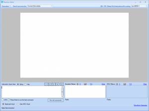
3.5 Instruction Input
- Text command input of any non-block Instructions (excludes if, for and while)
- Use the CRC checkbox to send the CRC (mode 1) with instructions
- Toggle hex mode to ensure byte precision in input.
(Answers the question of how to input less frequently used characters)
3.6 Simulator Return
- Any Return Data or print commands from Simulator will display here
- Expected to be sufficient to aid in the debugging process
- Not expected to be full trace logs (Simulator – not emulator)
- View in Hex or String format
View Line by Line (ÿÿÿ terminations), or by Total bytes in Hex
Context Menu (right click) to: Copy HEX, Copy STR, Copy HEX+STR
3.7 User MCU Return
- Any Return Data or print commands from Nextion/MCU will display here
- Expected to be sufficient to aid in the debugging process
- Not expected to be full trace logs (Simulator – not emulator)
- View in Hex or String format
View Line by Line (ÿÿÿ terminations), or by Total bytes in Hex
Context Menu (right click) to: Copy HEX, Copy STR, Copy HEX+STR
3.8 Input Selection
- Keyboard input is the default simulator input method.
- Cut, Copy, Paste and Delete added to right click context menu.
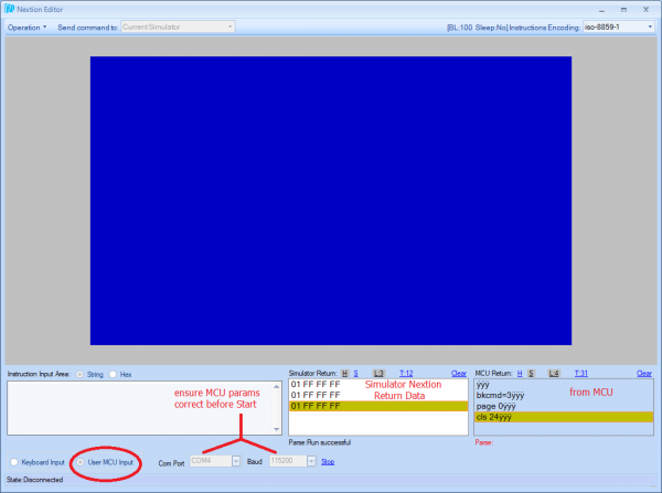
- Toggle to User MCU input to have user MCU interact with Simulator
- Select Com Port of user MCU, MCU operating baud rate and then Start
- Only one (Nextion device or User MCU) can be connected at a time
- When one is selected, the other is not available.
3.9 Connected Nextion Identification
- When Nextion is connected to Simulator, portions of connect string is shown here.
3.10 Waveform Generator
- Click here to show the Waveform Generator
3.11 Waveform Generator Options
- Sinewave or random waveform input at selected intervals.
- Expected to be sufficient to aid in the debugging process
- Not expected to be an oscilloscope (Simulator – not emulator)
3.12 Nextion Address
- Default is 0 – Nextion normal mode, 256 to 2815 in address mode.
- Address will only apply to specialized advanced applications.
3.13 Simulator Backlight and Sleep
- The current backlight value (dim command) while debugging
- The current sleep state indicated by Yes (sleep) or No (wake).
3.14 Saved Nextion Input
- The Debug Simulator now has 4 storage points for saving Input
- Clicking the S box will allow you to choose where to store
- Clicking a numbered box will recall the Input stored in the chosen slot
4. Uploading your Project your Device
Once you have completed designing your HMI project in the Nextion Editor and tested it with the Debug Simulator, it is now time to test it on your actual Nextion device. Note: With previous versions of the Nextion Editor, the Compile and Debug toolbar buttons created the project TFT file in the bianyi folder, note this has changed in favour of outputing your *.tft file directly to microSD card (or folder of your choice).
4.1 Uploading using a microSD card
To upload via microSD card, first use the TFT file output under the File menu to generate your TFT file to your microSD card. You need to ensure that your microSD card is Windows formatted as FAT32, that there is only 1 *.tft file on the microSD card in the root folder, that the microSD card is less than 32GB in size (32GB microSD cards generally are), that the power to Nextion device is off when inserting and removing the microSD card, and that you allow time for any firmware updates to occur after powering your Nextion device back on. Note: not all microSD cards are designed for embedded use. example: Ultra High Speed microSD cards for use with high speed digital cameras. Not all manufacturers adhere to the same standards. It is a matter of finding microSD cards that work for you in a reliable manner. As an example, We have had good successes with Kingston 32GB class 10 HC microSD cards … there are many many others that work well.
4.2 Uploading over Serial
Uploading over TTL Serial can be accomplished using the Upload toolbar button and selecting your configured COM port and baud rate. Keep in mind that Nextion devices are 5.0V devices (refer to your Nextion model’s Datasheet). As there are many many manufactures of USB to TTL Serial adapters, it remains within the User’s domain to understand their chosen TTL Serial Adapter to install, properly configure, and operate.
4.3 Nextion Upload Protocol
The Nextion Upload Protocol v1.1 has been published in the Nextion blog section. This allows users to upload their *.tft files over Serial without the Nextion Editor. As this is an advanced topic, it will not be covered in depth here. Please refer to the published Nextion Upload Protocol v1.1
5. External Tools
5.1 Font Creator
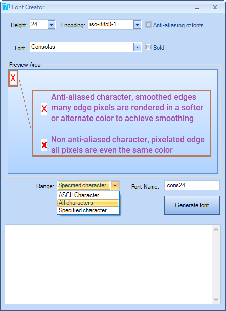
The Nextion Editor ZI Font Creator has undergone an overhaul to introduce proportional fonts with anti-aliasing. Height must be between 16 and 254 and Custom can be chosen to set a height not listed in the dropdown (between 16 and 254). Choosing Anti-aliasing of fonts option will generate an anti-aliased font. Leaving anti-aliased not selected will generate a mono-bit font. Previous embedded 1:2 ratio with width=1/2height has been replaced in favour of proportional fonts. Fixed width fonts can still be generated from a fixed width font source (such as Consolas). Fonts created in the new Font Creator are not compatible with v0.53/LTS. Any installed font on your system can be used as a source for generating your ZI font. ZI Fonts can now be limited to a specified range of characters, useful for subsetting your fonts to what is project required and reduce font resource space usage. (56 pixel height UTF-8 could be a very large ZI file at 23,168,377 bytes)
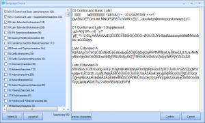
Using the UTF-8 font has requirements that event code is UTF-8 and project Encoding is UTF-8, but for those that are preferring to use UTF-8 over single byte or double byte encodings, The Font Generator can generate a ZI Font using user selected combinations of 142 UTF-8 subsets. Select Encoding as UTF-8 in the Font Creator and click on the languages(qty) link near the bottom to launch the subset selections. Once your Language Choice selections are selected, click confirm and Generate Font. (ensure Height, Encoding, Font, Antialiasing and Bold choices, and Font Name are done as usual)
5.2 Gmov Maker
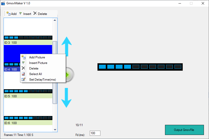
GMovMaker is a new tool for assisting in creating animations. Ensure that your resources are of uniform size. GmovMaker will create the sequence of images (frames) in the order you create and render your frames with the timing set for each frame (default of 100ms). Frame timing can be set between 30ms and 65000ms. The generated .gmov resource can then be added to your Nextion project as a single resource making your animations easy. GmovMaker will accept *.bmp, *.gif, *.jpg and *.png source files.
5.3 VideoBox
VideoBox is a new tool for the Intelligent Series used to create Audio Resource *.wav files from your audio sources, and Video Resource *.video files from your video sources.
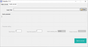
VideoBox will accept *.mkv, *.mp4, *.mov, *.avi, *.mpeg, *.mpg, *.rm, *.wmv, *.rmvb, *.3gp, *.mp3 and *.wav audio source files.
Audio can be run from the microSD card for the Intelligent Series, use the .from attribute of the Audio Component for external file.
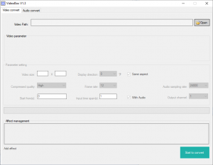
VideoBox will accept *.mkv, *.mp4, *.mov, *.avi, *.mpeg, *.mpg, *.rm, *.wmv, *.rmvb and *.3gp video source files. Resolution is limited to area w*h<=622592 where longest_edge<=4080 pixels.
Video can be run from the microSD card for the Intelligent Series, use the .from attribute of the Video Component for external file.
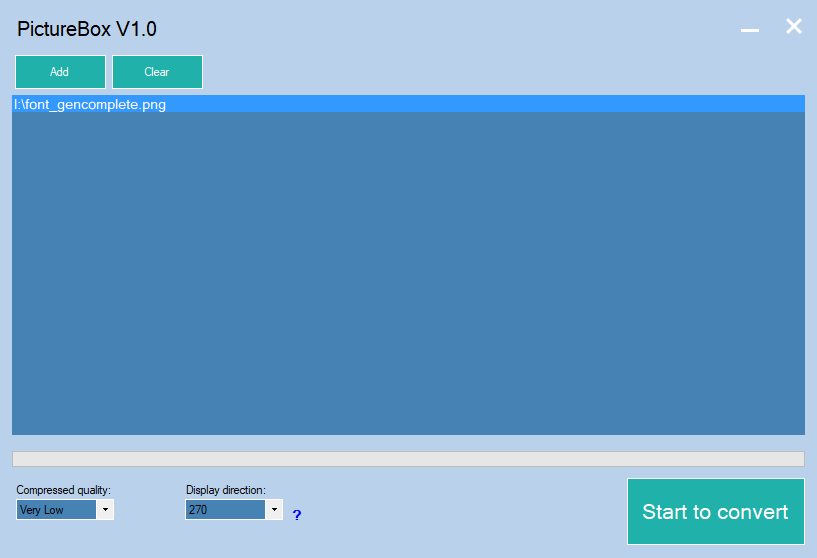
5.4 PictureBox
PictureBox is a new tool for the Intelligent Series used to create resources for the ExPicture components. Picture resources are then stored in ram or in the microSD card folder. Ensure to set the resource orientation the same as the proper orientation for your project. The tool will output your picture resource as an *.xi file. PictureBox will accept *.bmp, *.jpg, *.jpeg, and *.png source files.